User Guide
Accessing the National Risk Index Map
The National Risk Index Map is an interactive map with several features for visualizing natural hazard risk. You can explore the map and search for specific datasets, control the layers of data displayed, change the background and data groupings, and even create reports.
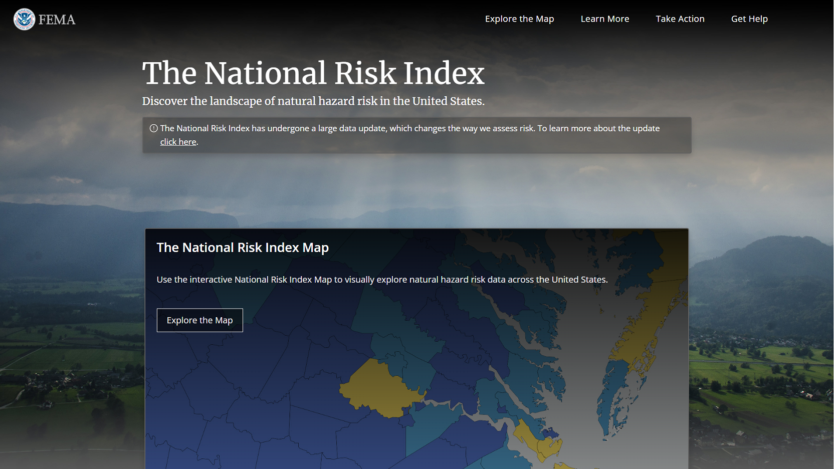
Access the map by clicking the Explore the Map button at the top of any page.
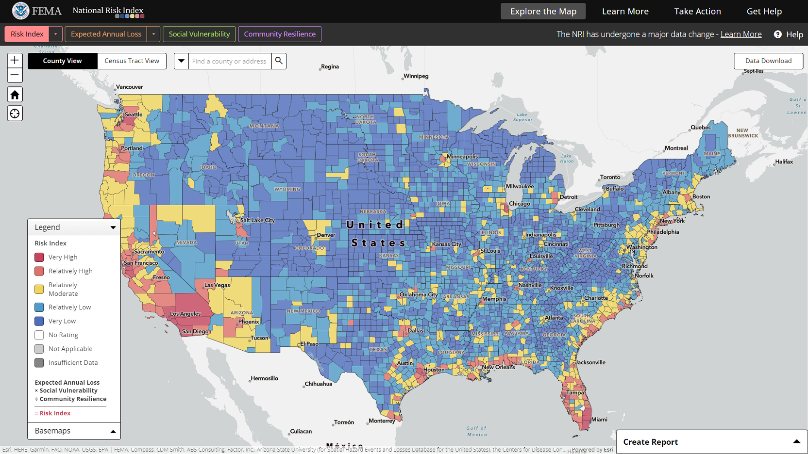
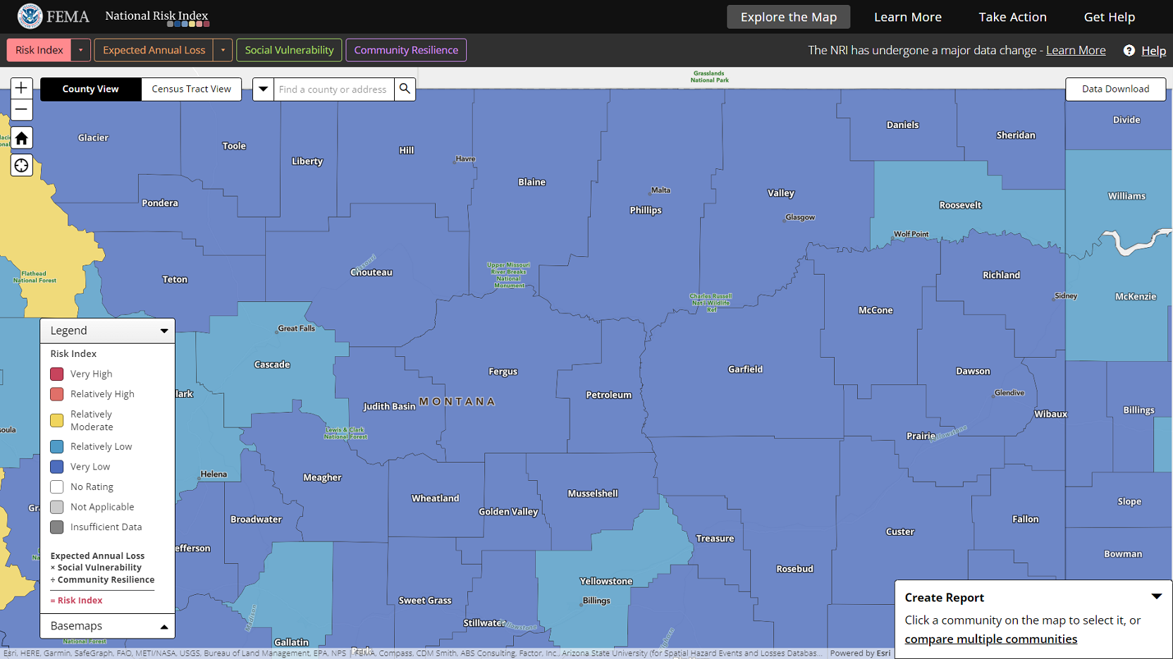
The map opens showing the Risk Index map layer. The map contains information panels, as well as navigation, search, and reporting features, which are detailed below.
Reviewing the National Risk Index Map Layers
The National Risk Index Map has a total of 40 map layers you can use to visualize the data of the National Risk Index. By default, the Risk Index layer for All Natural Hazards is active, meaning it is the layer displayed on the map and highlighted in the map layers toolbar. The other layers—which include Expected Annual Loss, Social Vulnerability, and Community Resilience—represent the underlying risk components that make up the Risk Index.
By default, Risk Index and Expected Annual Loss layers show a composite rating for all 18 natural hazards included in the Index. For both the Risk Index and Expected Annual Loss, you can also visualize individual layers for each hazard type.
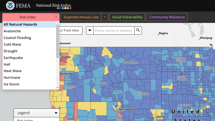
Click the buttons in the map layers toolbar to toggle between the available map layers. Click the dropdown arrows to see the list of hazard type-specific layers for the Risk Index and Expected Annual Loss and select a layer name in the list to show it on the map. Choose the All Natural Hazards option at the top of the list to return to the composite rating layer for all hazard types.
Map Layers Legend
Each component of the Risk Index is visualized with a unique color scheme that represents the component's ratings. The map's legend provides a description of the ratings currently shown in the map and highlights how the visible risk component fits into the National Risk Index risk equation.
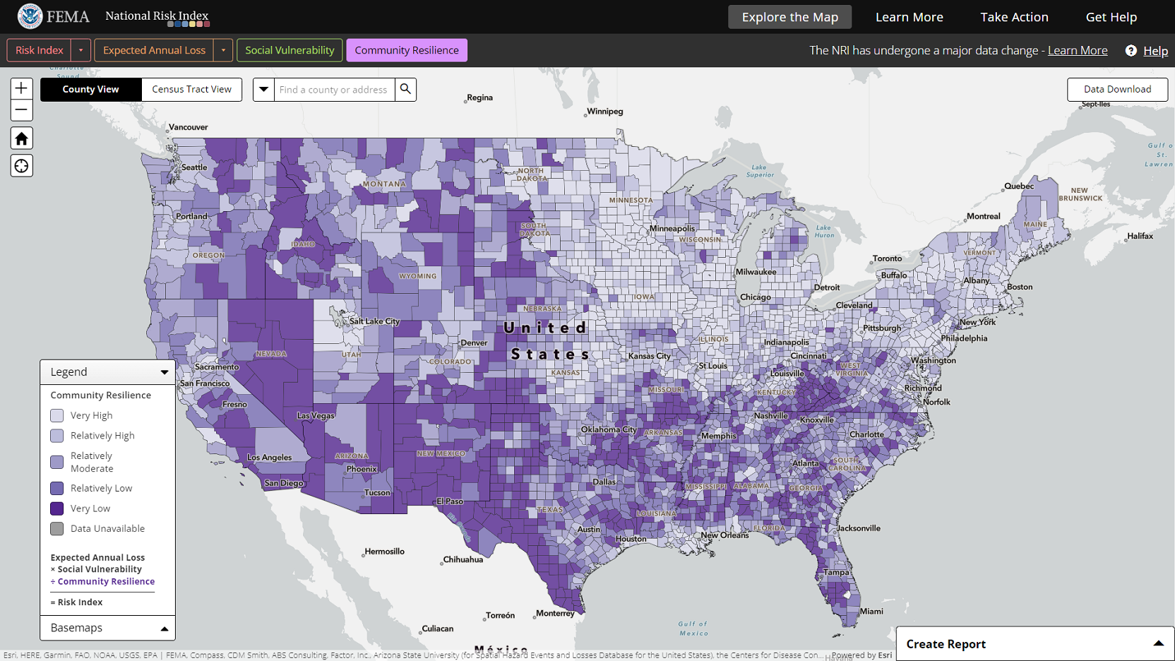
Click the legend panel header to hide or show the panel on the map.
Basemaps
The basemap is the background map shown behind the National Risk Index layers. It can include place names, administrative boundaries, roads and highways, topography, and other data to help you orient yourself when looking at the map.
Available basemaps include:
- The Canvas basemap, which shows state boundaries, major roadways, and some water features.
- The Streets basemap, which shows additional detail including city and town names, interstate numbers, and some water feature names.
- The Satellite basemap, which shows an aerial image along with place names.
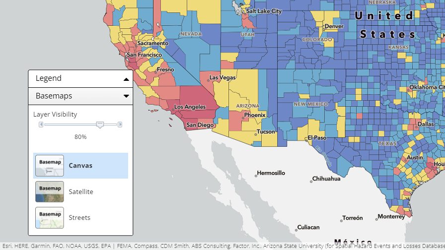
Click the basemaps panel header to show or hide the panel on the map.
Click the desired basemap name to change it on the map. More basemap details appear as you zoom in on the map.
The slider at the top of the basemaps panel controls the visibility of the map layers. The less visible a map layer is, the easier it is to see the basemap underneath.
Click and drag the slider to change the visibility of map layers:
- Drag to the left to decrease visibility of the map layer and increase visibility of the basemap.
- Drag to the right to increase visibility of the map layer and decrease visibility of the basemap.
Finding a Community on the National Risk Index Map
Map Data Views
The National Risk Index Map can be viewed at the county or Census tract level of detail. By default, the map is set to the county-level view. Use the data views toggle button at the top of the map to switch between the county and Census tract views.

Map Navigation
There are various ways you can interact with and visually explore the map to find communities of interest. The map's navigation features are located at the top-left side of the map.
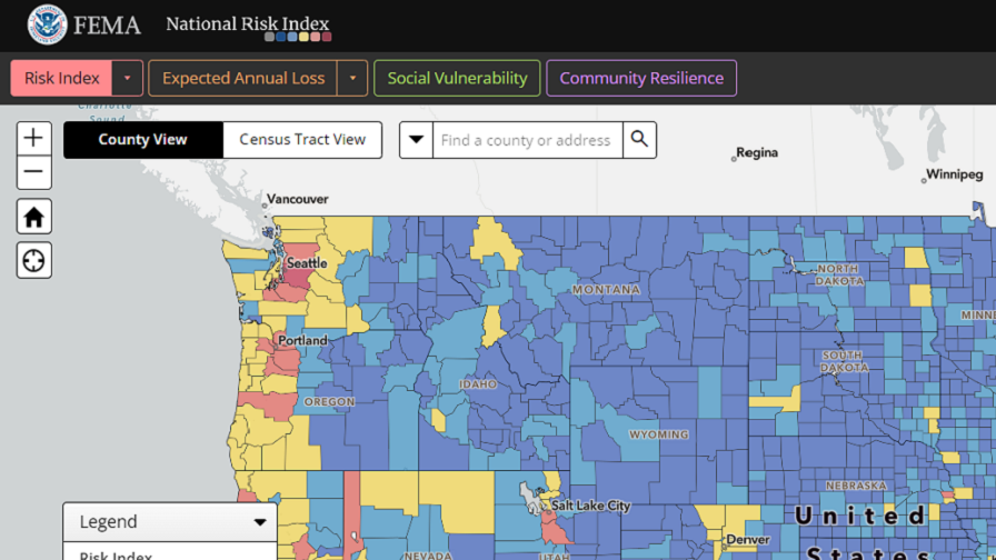
Click the plus button to zoom in and the minus button to zoom out. This zooms the map in or out at a fixed distance from the center of the map.
Click the zoom to full extent button (looks like a house) to zoom out to the original map extent (the conterminous United States).
You may also zoom in/out on the map from a location by pointing your cursor and using your mouse's scroll wheel. Scroll up to zoom in and scroll down to zoom out.
Pro Tip: To quickly zoom in on an area, hold down the Shift key, then left click and drag on the map to draw a box. Release the click to zoom in on the area within the drawn box.
To pan or move around the map, left click and hold your cursor on the map. Your cursor will change to the shape of a hand. Drag the hand around the screen to move the map and release the click to center the map on a new area.
Search
The map's search feature is available at the top of the map window. The search box allows you to type in a county name, place name, address, or Census tract number to find it on the map.
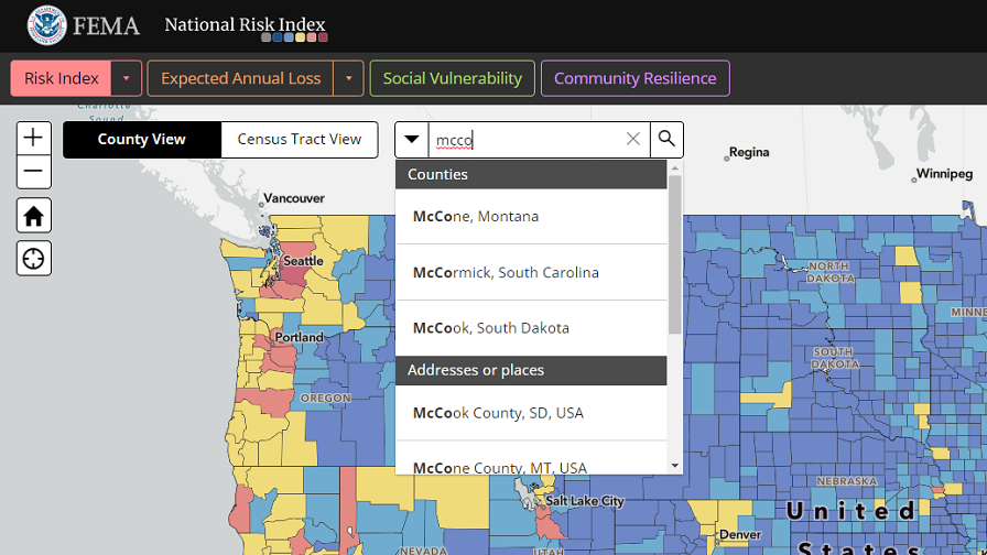
Click in the search box and type in the community you want to find.
Click the search button (looks like a magnifying glass) or press Enter on your keyboard to perform your search.
Search results appear in a dropdown list. Scroll down the list to see all results captured in a search.
The search feature gives you results that match your current view:
- If you are in the county view, then results are sorted first by counties and then addresses or places.
- If you are in the Census tract view and search for a Census tract number, Census tracts sort to the top of the list, followed by addresses and place names.
Use the dropdown to the left of the search box to search by only one of these community/location types.
Data Download
The Data Download button leads users to our Data Resources page where users can download data in several different formats. The National Risk Index data are available for download as a File Geodatabase, Shapefile, or in a table format as a CSV file for all US counties, Census tracts, States, and Tribal areas. The data can also be downloaded by State at the county or Census tract as a CSV file. The Data Glossary, Data Dictionary, Metadata, and GIS Services are also available from this page.
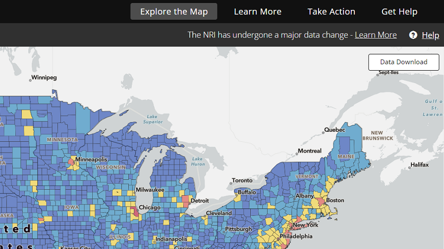
Click the data download button to link to the National Risk Index Data Resources page.
Navigate and download appropriate data resources.
Selecting and Reviewing a Community's Risk Details
Community-based risk information and details are shown when you select a community (i.e., county or Census tract).
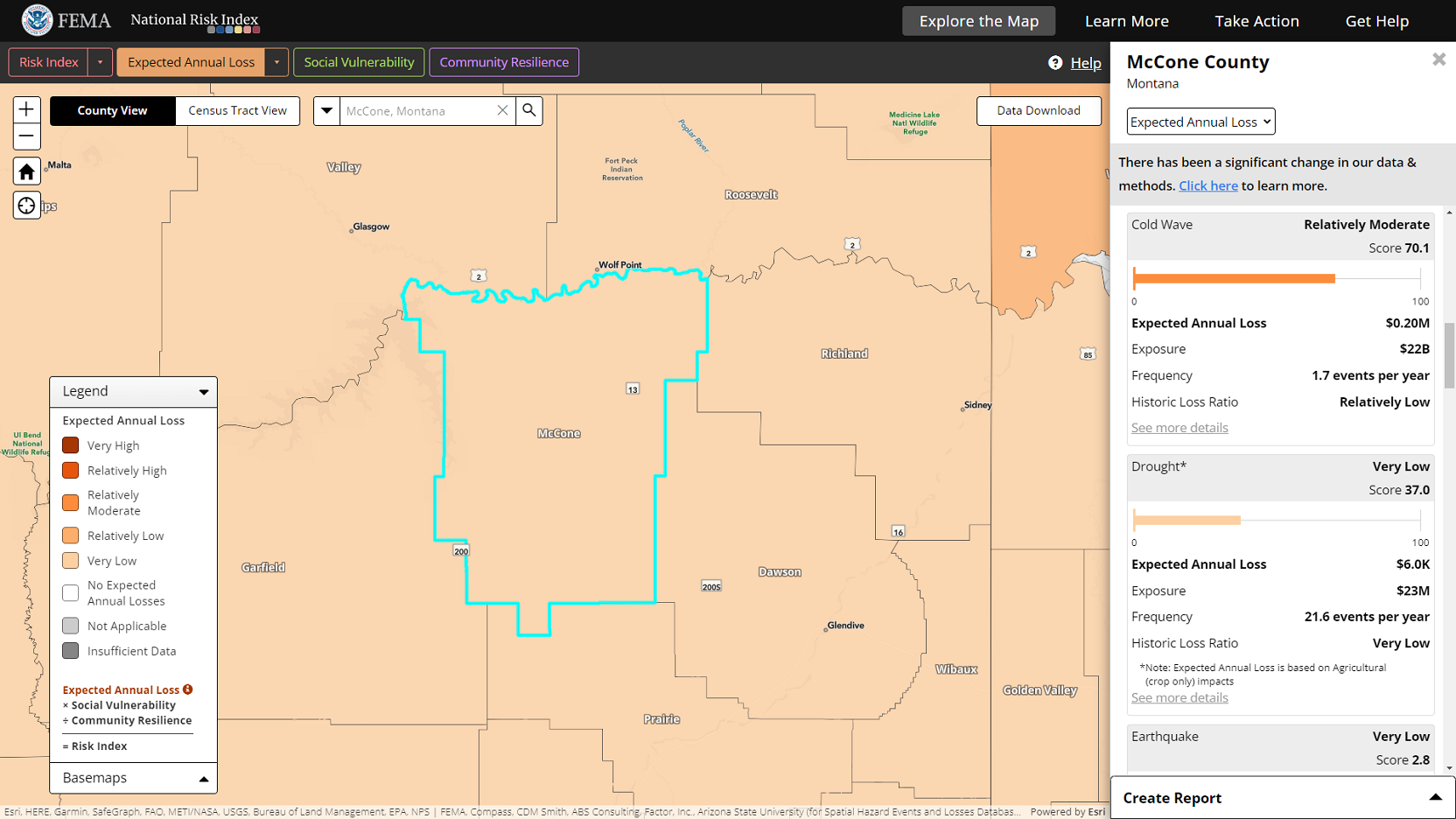
Click on a community in the map to select it. If you use the search feature to find a community, click the desired community in the results list to select it. When a community is selected, it is highlighted in Cyan (light bright blue) in the map and the information panel opens on the right side of the screen.
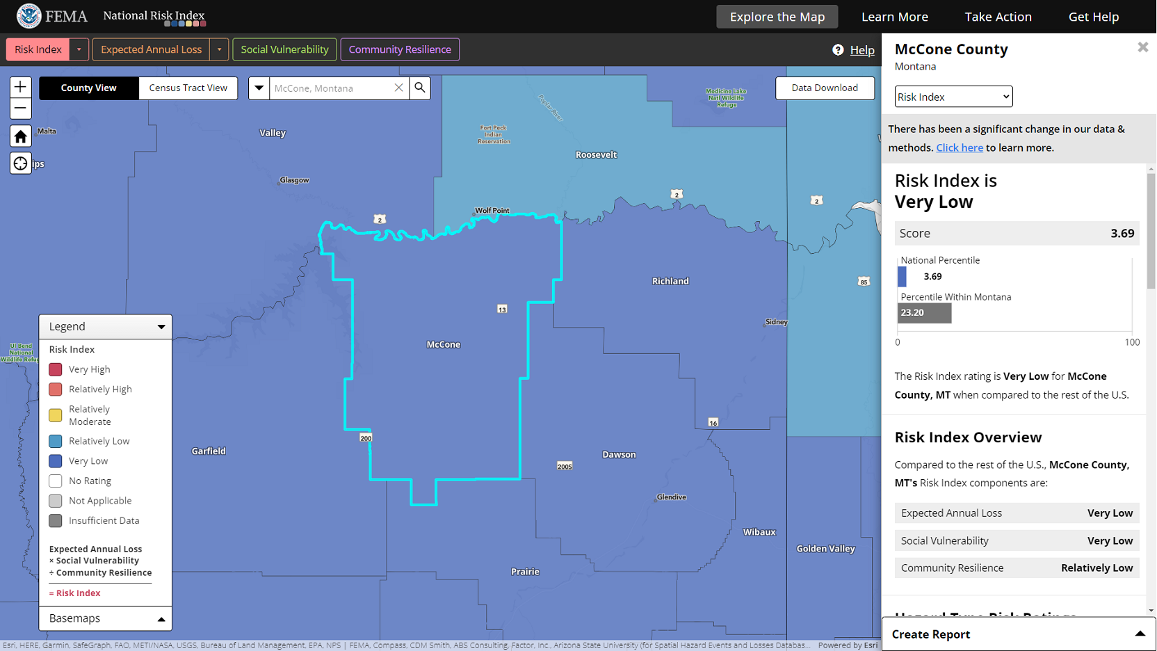
The top portion of the information panel contains a dropdown list of the available panel views. Views correspond with National Risk Index risk components and display their underlying details. You will need to scroll down in the panel to view all available details.
When you select a community on the map, the information panel will first show details that match the active map layer. For example, if you are reviewing the Social Vulnerability layer, the panel will open to the Social Vulnerability view.
Click the information panel dropdown to see the views available and click a view option to select and switch to it. Note that when doing so, the map layer will not change. If you want to change the map layer to match the panel view, click the Show on map link at the top of the panel.
If you want to see information for a different community, simply search for or click the community on the map to select it. This changes the highlighted community on the map and the details shown in the information panel. Only one community may have its data shown in the panel at a time.
Click the X in the top right corner of the information panel or click on the selected community to both close the information panel and remove the selection on the map.
Use the National Risk Index Data Lookup to select a community using a form (instead of a map) and create a Community Risk Profile Report with the community's risk information/details.
Using the National Risk Index Map's Reporting Feature
Creating a report is a way to extract information out of the National Risk Index Map and into a separate document. A report can contain detailed information about a single community (county or Census tract) or compare multiple communities.
When a report is created, a webpage opens in a new browser tab. The webpage contains the report, as well as features to print the report, create additional reports for further analysis, and download National Risk Index data based on your community selection. Every report webpage you create will have its own unique URL (i.e., web address). Copy and save report URLs or bookmark them in your browser for future reference.
Reports are created using the create report panel located in the bottom-right corner of the map window. When the information panel is displayed, the create report panel appears on top of the information panel at the bottom.
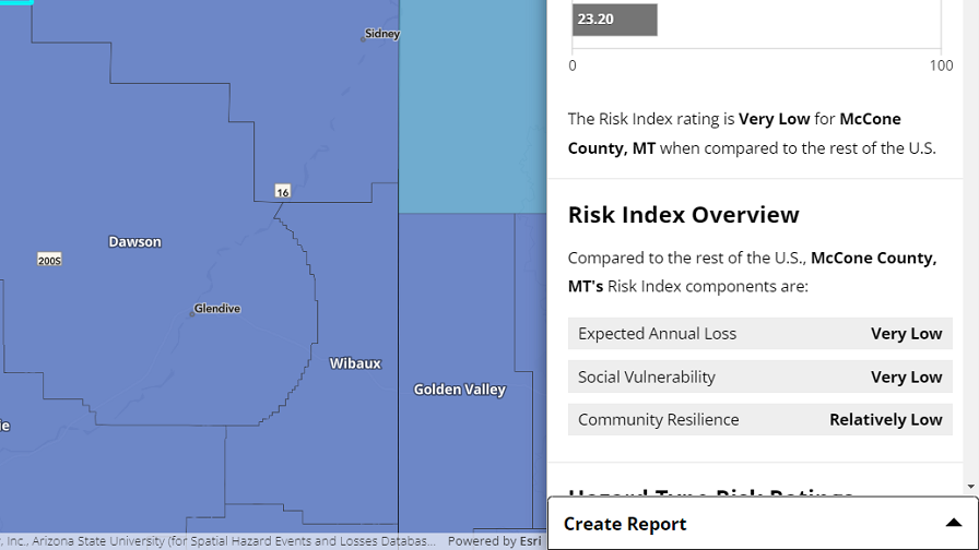
Click the create report panel header to show or hide the panel. You may hide the panel at any point in the report creation process to pause it and view the information panel.
The sections below describe how to create either a Community Risk Profile Report or a Community Risk Comparison Report.
Pro Tip: Before you start creating a report, switch to the county view if you want to create a county report, or switch to the Census tract view if you want to create a Census tract report. Switching between county and Census tract views in the middle of creating a report will cause you to lose your selection and start over.
Creating a Community Risk Profile Report
A Community Risk Profile Report provides all available risk information and details for a single county or Census tract.
To create a Community Risk Profile Report, start by selecting a single county or Census tract on the map.
Then, click the create report panel header in the bottom-right corner to show the panel. The panel will identify your selection. The community will be highlighted on the map with both a cyan border and magenta (bright pinkish purple) crosshatch because it is selected for both the information panel and Community Risk Profile Report.
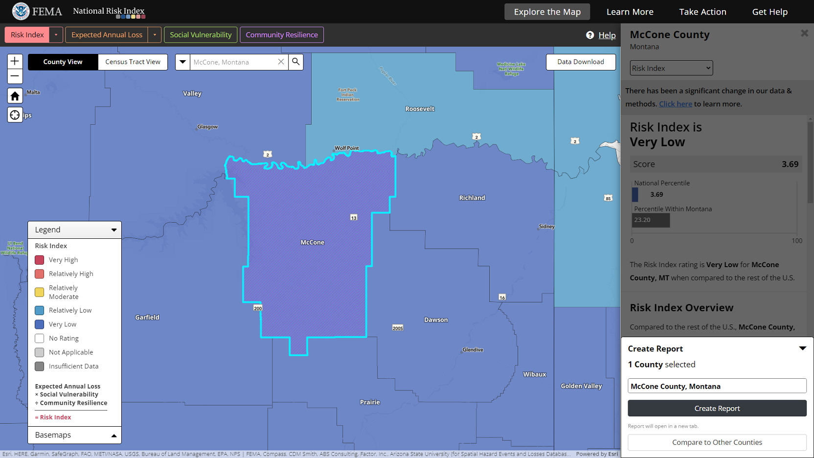
Click the Create Report button to create a report for the selected community. The report will open in a new browser tab.
If you did not select a community before opening the create report panel, the panel will prompt you to either select a community for a Community Risk Profile Report or to begin a selection process to compare multiple communities.
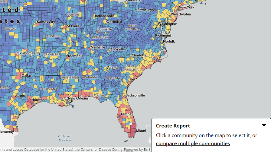
Select a community on the map to continue with the Community Risk Profile Report creation process. Once you select a community, the panel will identify your selection and you can create the report by clicking Create Report.
A Community Risk Profile Report can also be quickly created while you are reviewing a community's Expected Annual Loss details for specific hazards types in the information panel. Click the See more details link to open a report for the selected community and navigate directly to its Expected Annual Loss section.
The Community Risk Profile Report
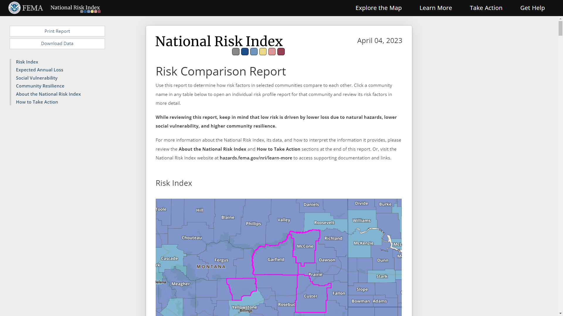
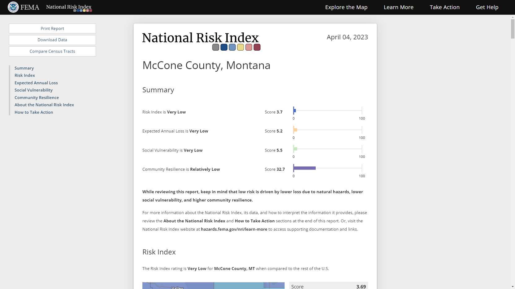
A Community Risk Profile Report includes charts, maps, data tables, and descriptions specific to the selected county or Census tract. Use the buttons in the top-left corner to print the report and download National Risk Index data in table (CSV) format for the selected community.
County Reports Only
Click the Compare Census Tracts button to quickly create a Community Risk Comparison Report in a new browser tab that includes a county's Census tracts. This additional feature is available for single county reports only.
Attention: When creating a Community Risk Comparison Report, you are limited to selecting a maximum of 20 communities per report. If you select more than 20 communities, a report will be created that includes 20 communities with the highest Risk Index of the selection. Then, you will be given the option to download the data for all selected communities or only the 20 communities with the highest Risk Index in table (CSV) format.
Creating a Community Risk Comparison Report
A Community Risk Comparison Report allows you to compare multiple counties to each other or multiple Census tracts to each other by leveraging the scores and ratings provided by the National Risk Index.
The ways to create a Community Risk Comparison Report are outlined below.
Starting with No Communities Selected
With no communities selected, open the create report panel and find the general area from which you want to select communities for a report.
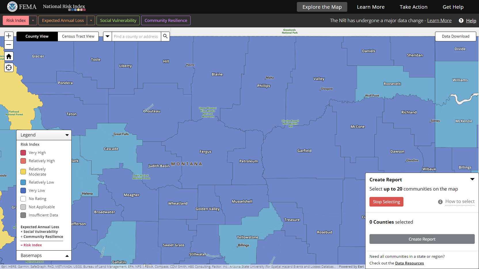
Click the compare multiple communities link. The create report panel will expand, and the multiple selection mode will be activated. The Stop Selecting button will be visible, and you will be prompted to select communities on the map.
Starting with One Community Selected
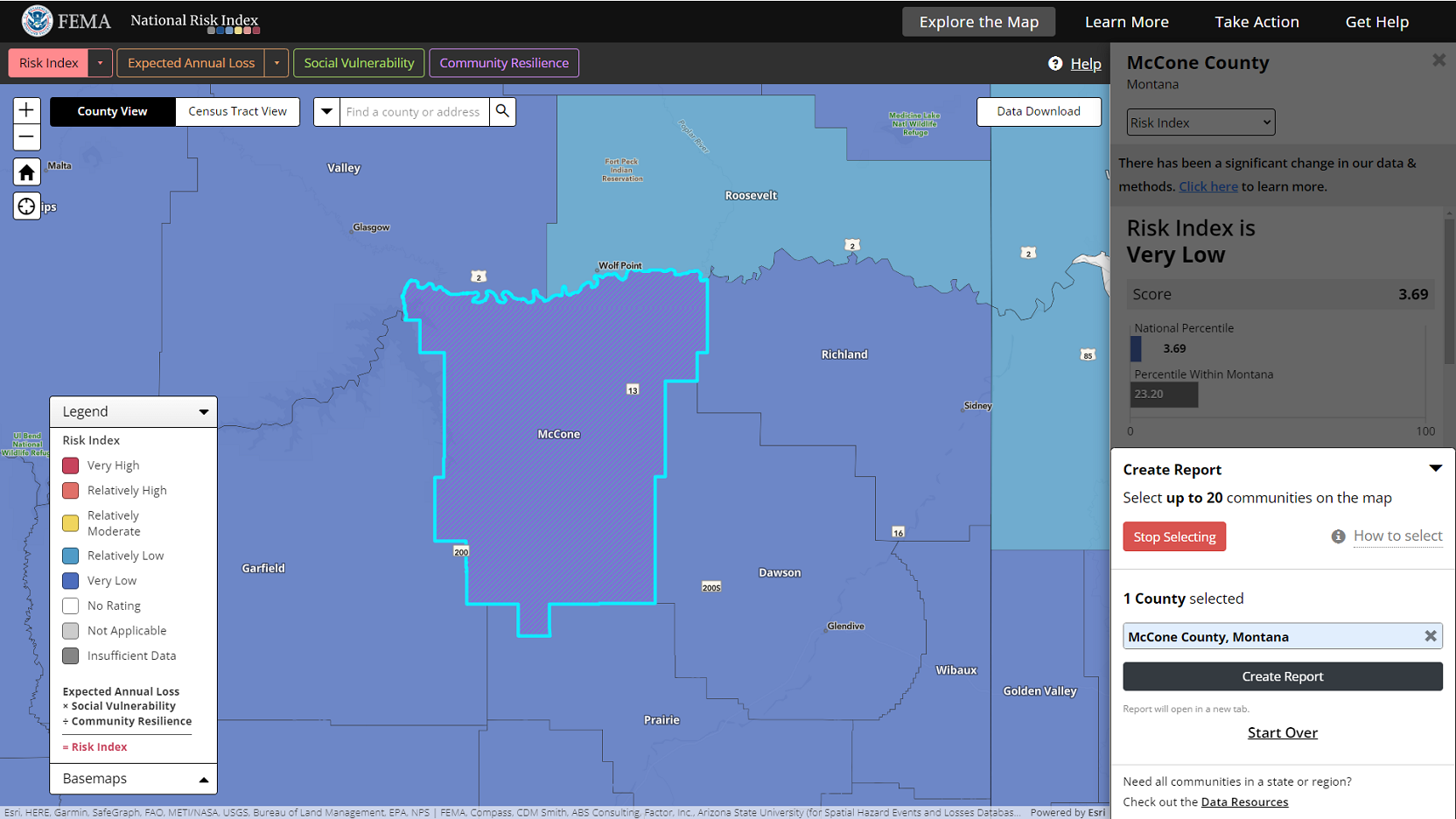
If you began the report creation process by selecting a community, you can turn the single selection into the starting point for a Community Risk Comparison Report by clicking the Compare to Other Counties (or Census Tracts) button.
After clicking the Compare to Other Counties (or Census Tracts) button, the create report panel will expand, the multiple selection mode will be activated, the Stop Selecting button will be visible, and you will be prompted to select communities on the map. The single community you previously selected will be included in the selection count and list of communities in the panel and will be highlighted on the map with a cyan border and magenta crosshatch.
Selecting Communities for the Report
With multiple selection mode activated (the Stop Selecting button will be visible), click individual communities on the map to select them, or click and drag to draw a box on the map and select all communities within it.
As you select communities, the create report panel will update with the count and names of selected communities for the Community Risk Comparison Report. On the map, selected communities will be highlighted with a magenta border and crosshatch. The community selected for both the information panel and report will be highlighted with a cyan border and magenta crosshatch on the map, and its name in the panel list will be highlighted.
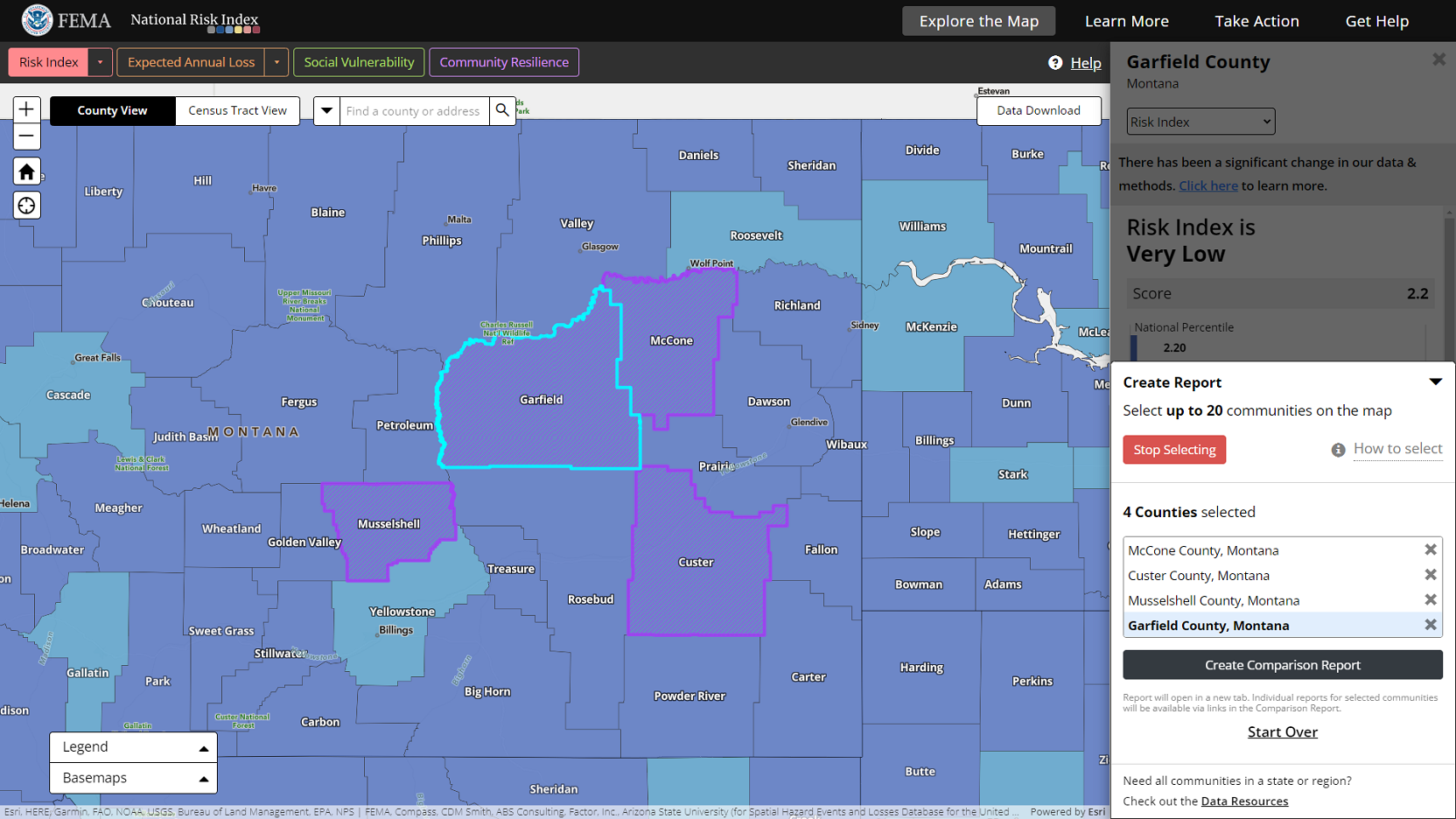
To remove selected communities, click the X next to their name listed in the panel, or click selected communities on the map when in multiple selection mode.
While multiple selection mode is activated, you will not be able to move around the map. Click the red Stop Selecting button to exit selection mode and move around the map.
Click the Start Selecting button to reactivate multiple selection mode and select more communities.
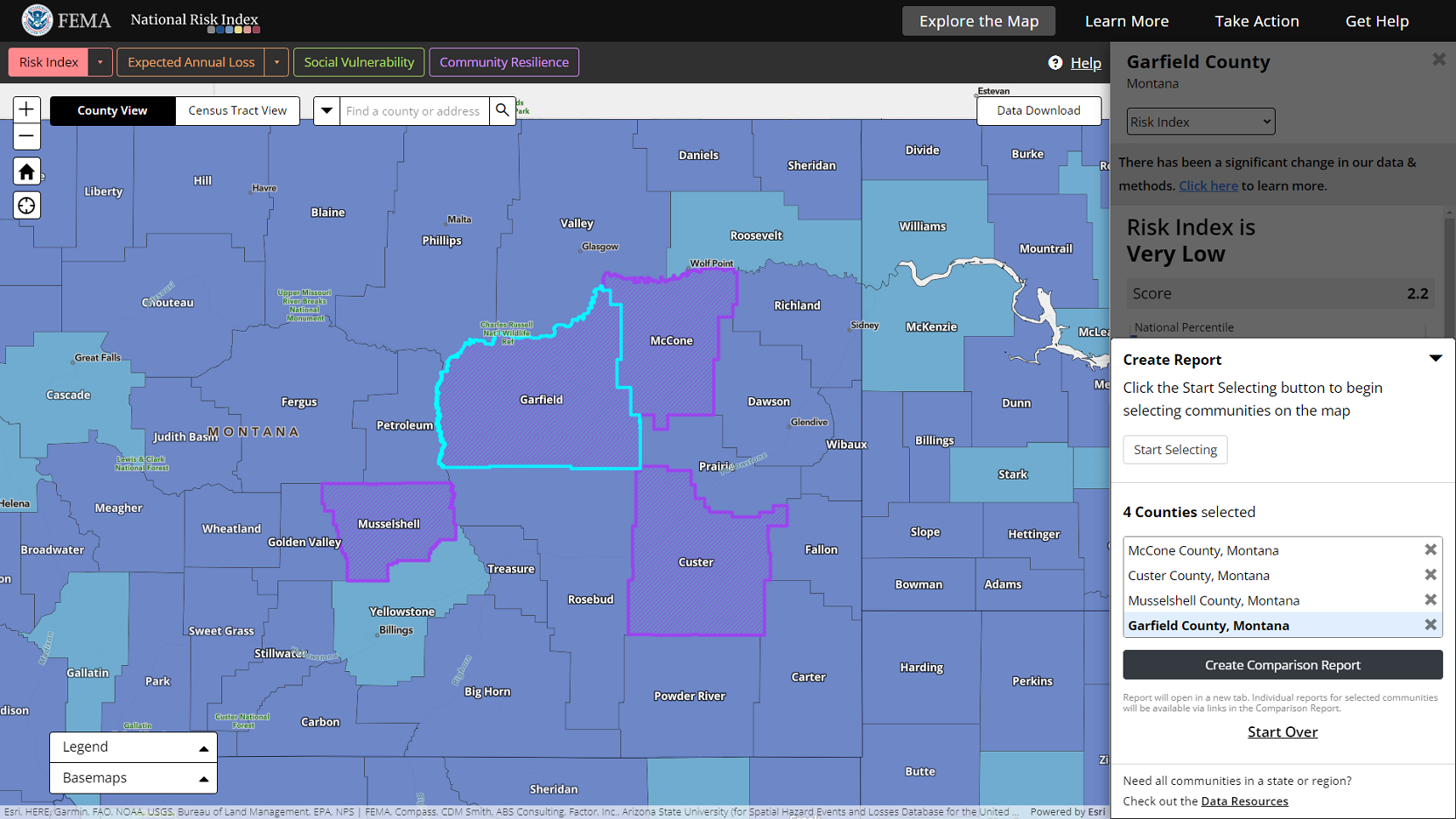
If you choose to hide the create report panel in the middle of creating a report, your selections will be temporarily saved. The community name that is highlighted in the list will remain the actively selected community. Risk information and details for this community will be what is displayed in the information panel. Click the create report panel header to re-open the panel and continue the report creation process.
Click the Create Comparison Report button to create a report with the selected communities.
Click the Start Over link to remove all selected communities and start from the beginning.
The Community Risk Comparison Report
A Community Risk Comparison Report provides a table for each National Risk Index risk component that sorts selected counties or Census tracts by their scores from high-to-low for quick comparison. Buttons located in the top-left corner enable you to print the report or download the data supporting it in table (CSV) format. Location names in the report tables are hyperlinked. Click on a community's name to open a separate Community Risk Profile Report for the community in a new browser tab and review its details.
